Bootstrap Introduction
You have likely worked with Bootstrap before, either in previous courses or for your personal or professional projects. It is an extremely popular front-end toolkit used to build websites / user interfaces.
Here, we will be discussing Bootstrap 5.1 - this is important because Bootstrap 5 is the first version to drop support for Internet Explorer as well as no longer require jQuery as a dependency.
NOTE: The full Bootstrap 5.1 Documentation provides a ton of great resources expanding on what is discussed below. The following documentation describes enough of the core components to get started and build a simple user interface only. Please refer back to the original documentation for examples and guides on how to use the many other great UI components provided by Bootstrap 5.1 not mentioned here.
Including Bootstrap 5
The simplest way to include Bootstrap in our projects is to add the CDN links directly in our HTML files. Alternatively, you can download the Source Files and customize them yourself using Sass, or use a package manager (ie: npm) to install Bootstrap.
For simplicity, we will include the CDN links directly in our HTML document, ie:
<!DOCTYPE html>
<html lang="en">
  <head>
    <meta charset="UTF-8" />
    <meta name="viewport" content="width=device-width, initial-scale=1.0" />

    <!-- Bootstrap 5.1 CSS-->
    <link
      href="https://cdn.jsdelivr.net/npm/bootstrap@5.1.3/dist/css/bootstrap.min.css"
      rel="stylesheet"
      integrity="sha384-1BmE4kWBq78iYhFldvKuhfTAU6auU8tT94WrHftjDbrCEXSU1oBoqyl2QvZ6jIW3"
      crossorigin="anonymous"
    />

    <!-- Bootstrap 5.1 JS Bundle -->
    <script
      src="https://cdn.jsdelivr.net/npm/bootstrap@5.1.3/dist/js/bootstrap.bundle.min.js"
      integrity="sha384-ka7Sk0Gln4gmtz2MlQnikT1wXgYsOg+OMhuP+IlRH9sENBO0LRn5q+8nbTov4+1p"
      crossorigin="anonymous"
    ></script>

    <title>Bootstrap Practice</title>
  </head>
  <body></body>
</html>
Grid System
Arguably one of Bootstrap's best features has been the responsive utilities and the responsive grid system. Once you have planned the layout for your application, this is typically the first place to start placing UI elements and organizing your layout.
If you have used Bootstrap before, the core concept should be familiar: Place your main content within a "container" element, each logical row of your layout within a "row" element and each column within a "col" element, for example:
<div class="container">
  <div class="row">
    <div class="col">Column</div>
    <div class="col">Column</div>
  </div>
</div>
The above code will render a single "row" with two columns of equal width within a "container". The width of the columns will always remain side-by-side and of equal width regardless of the size of the browser window.
Notice how we did not have to specify the number of "columns", each div takes up (from a total of 12). Since we have only 2 columns in the above example, Bootstrap automatically assigns each column a width of "6" (totaling 12 columns). If we wish to change this behaviour and have one of our columns shorter or longer than the other, then we can use the familiar "column-counting" pattern, ie:
<div class="col-3">Column</div>
<div class="col-9">Column</div>
Using the above code, you can see that the 2nd column takes up 9 (of 12) columns, while the other column takes the remaining 3.
NOTE: To achieve two equal width columns, two "col-6" classes would work as well.
You will also notice at certain points the layout "jumps" and the width of both columns are either increased or decreased, while remaining in the center of the container. This is because bootstrap 5 uses 6 Responsive Breakpoints, essentially representing 6 typical viewport / device sizes. From the documentation, you can see that these breakpoints (the places that the layout "jumps" when resizing) fall at the following viewport widths:
| Breakpoint | Class infix | Dimensions |
|---|---|---|
| X-Small | None | <576px |
| Small | sm | ≥576px |
| Medium | md | ≥768px |
| Large | lg | ≥992px |
| Extra Large | xl | ≥1200px |
| Extra Extra Large | xxl | ≥1400px |
From the above table, we can see that Bootstrap 5 identifies a viewport width of anything less than 576px as "X-Small", while everything between 576px and 767px is considered "Small" and so on. As we have done in previous versions of Bootstrap, we can use the "infix" value with a specified class name, to target certain viewport sizes in order to change the layout of our grid.
For example, say we wish for our two-column "3, 9" layout from above to change its column widths at a specific viewpoint. A common, simple case is to have the columns "collapse" into a single column at the "Small" size, thus making the UI easier to read on mobile browsers.
To achieve this using the above table for reference, we can use the following code to specify that we only wish our columns to remain at the "3,9" layout for sizes "Medium" and above:
<div class="col-md-3">Column</div>
<div class="col-md-9">Column</div>
Additional Options
The above code will give us all of the flexibility that we require for simple layouts, however Bootstrap 5 offers additional options such as:
- Mix and Match - The "col-" classes can be applied multiple times to a div, allowing finer control over how the div will display within the grid at different viewport widths.
- Row Columns - Used to specify how many rows should be created when multiple "col" classes are used, allowing columns to carry over to additional rows
- Nesting - As in previous versions of Bootstrap, columns can be nested depending on your layout needs
Navigation Bar
Another common starting point for any application is to design and code a navigation bar to make traversing your app simple and intuitive. Once again, Bootstrap provides an excellent starting point to create a clean, responsive navigation bar. To begin, you only need a single <nav> element (typically placed above our main "container") containing a "container-fluid":
<nav class="navbar navbar-expand-lg navbar-light bg-light">
  <div class="container-fluid"></div>
</nav>
Notice how our <nav> element has a number of classes added to it. Each of these classes provides the following look / functionality:
navbar - This is the main class defining / styling the navigation bar
navbar-expand-lg - This class is used to set the viewport minimum width for a full sized navigation bar. Anything smaller than the "lg" size (992px) will cause the content of the navigation bar to collapse into a sub menu with a "Hamburger" Icon
navbar-light - This controls the colour / brightness of the items on the navigation bar. "navbar-light" will give you darker text (to be used on a lighter background), whereas "navbar-dark" will give you lighter text (to be used on a darker background)
bg-light - This controls the colour / brightness of the background of the navigation bar. "bg-light" will give you a light coloured background, whereas "bg-dark" will give you a darker one. You may also use one of Bootstrap's predefined theme colours, ie:
- "bg-primary"
- "bg-secondary"
- "bg-success"
- "bg-danger"
- "bg-warning"
- "bg-info"
Navigation Items
All of the various items placed on the navigation bar will be located within the "container-fluid" <div>. Why don't we expand our navigation bar to contain the items listed in the Bootstrap documentation:
<nav class="navbar navbar-expand-lg navbar-light bg-light">
  <div class="container-fluid">
    <a class="navbar-brand" href="#">Navbar</a>
    <button
      class="navbar-toggler"
      type="button"
      data-bs-toggle="collapse"
      data-bs-target="#navbarSupportedContent"
      aria-controls="navbarSupportedContent"
      aria-expanded="false"
      aria-label="Toggle navigation"
    >
      <span class="navbar-toggler-icon"></span>
    </button>
    <div class="collapse navbar-collapse" id="navbarSupportedContent">
      <ul class="navbar-nav me-auto mb-2 mb-lg-0">
        <li class="nav-item">
          <a class="nav-link active" aria-current="page" href="#">Home</a>
        </li>
        <li class="nav-item">
          <a class="nav-link" href="#">Link</a>
        </li>
        <li class="nav-item dropdown">
          <a
            class="nav-link dropdown-toggle"
            href="#"
            id="navbarDropdown"
            role="button"
            data-bs-toggle="dropdown"
            aria-expanded="false"
          >
            Dropdown
          </a>
          <ul class="dropdown-menu" aria-labelledby="navbarDropdown">
            <li><a class="dropdown-item" href="#">Action</a></li>
            <li><a class="dropdown-item" href="#">Another action</a></li>
            <li><hr class="dropdown-divider" /></li>
            <li><a class="dropdown-item" href="#">Something else here</a></li>
          </ul>
        </li>
        <li class="nav-item">
          <a class="nav-link disabled">Disabled</a>
        </li>
      </ul>
      <form class="d-flex">
        <input class="form-control me-2" type="search" placeholder="Search" aria-label="Search" />
        <button class="btn btn-outline-success" type="submit">Search</button>
      </form>
    </div>
  </div>
</nav>
This is a great starting point for building your own navigation, since it contains starter code for many of the elements that you may wish to use in your own navigation bar, such as:
navbar-brand
<a class="navbar-brand" href="#">Navbar</a>
This is the large text appearing at the left of the navigation bar (typically the title of the site / app)
navbar-toggler
<button
  class="navbar-toggler"
  type="button"
  data-bs-toggle="collapse"
  data-bs-target="#navbarSupportedContent"
  aria-controls="navbarSupportedContent"
  aria-expanded="false"
  aria-label="Toggle navigation"
>
  <span class="navbar-toggler-icon"></span>
</button>
This is the "Hamburger" button that will toggle the visibility of the navigation items (see "collapse" below) if the viewport width falls below the "navbar-expand-' value" (in this case it is "navbar-expand-lg" - from above).
collapse
<div class="collapse navbar-collapse" id="navbarSupportedContent">...</div>
This <div> is the container for the main navigational elements of our navigation bar. Notice the "id" value matches the "data-bs-target" property of the "navbar-toggler", allowing this container to be shown/hidden if the "Hamburger" button is toggled.
navbar-nav
<ul class="navbar-nav me-auto mb-2 mb-lg-0">
  ...
</ul>
Nested within the "collapse" container (above) is the unordered-list defining all of our navigation items. The additional classes added to the element are to help with the spacing.
nav-item
<li class="nav-item">...</li>
These are all of the actual links contained within the navigation bar. They may take the form of either:
<a> elements with the class "nav-link" (optionally "active" for the current element)
<a> elements with the class "nav-link" and "dropdown-toggle" - to be used to create a "dropdown" menu within your navigation bar. The full code for the dropdown looks like:
<a
  class="nav-link dropdown-toggle"
  href="#"
  id="navbarDropdown"
  role="button"
  data-bs-toggle="dropdown"
  aria-expanded="false"
>
  Dropdown
</a>
<ul class="dropdown-menu" aria-labelledby="navbarDropdown">
  <li><a class="dropdown-item" href="#">Action</a></li>
  <li><a class="dropdown-item" href="#">Another action</a></li>
  <li><hr class="dropdown-divider" /></li>
  <li><a class="dropdown-item" href="#">Something else here</a></li>
</ul>
form
<form class="d-flex">
  <input class="form-control me-2" type="search" placeholder="Search" aria-label="Search" />
  <button class="btn btn-outline-success" type="submit">Search</button>
</form>
Finally (outside of the "navbar-nav" unordered list), It is possible to have <form> elements nested within the navbar. This may be used if we wish to implement search or login functionality, for example.
Buttons
The bootstrap "btn" and "btn-{colour}" classes allow us to easily create consistent, clean buttons within the user interface that match current theme.
To create a button in Bootstrap, simply use the class "btn" and select a "theme" colour (these will be the same colours as the navbar background options), ie:
<button class="btn btn-primary">Button</button>
will render a button with the "primary" colour as its background. If we want to use one of the other colours, one of the predefined theme colours can be used as a suffix for the "btn-" class, ie:

<button class="btn btn-primary">Primary</button>
<button class="btn btn-secondary">Secondary</button>
<button class="btn btn-success">Success</button>
<button class="btn btn-danger">Danger</button>
<button class="btn btn-warning">Warning</button>
<button class="btn btn-info">Info</button>
<button class="btn btn-light">Light</button>
<button class="btn btn-dark">Dark</button>
In addition to the standard look above, Bootstrap also offers some customization options, including:
- Rendering the buttons using only their outline
- Modifying the size of the buttons
- Showing the button in a disabled state
- Rendering full-width block buttons
Dropdowns
One extremely useful variation on the button is the "dropdown" button, effectively creating a button that, when clicked, shows a menu containing more links / buttons. Dropdowns are widely used and allow us to preserve space on the user interface. To create a dropdown button in Bootstrap, the following code can be used:
NOTE: both <button> and <a> can be used in the following example
<div class="dropdown">
  <button
    class="btn btn-secondary dropdown-toggle"
    type="button"
    id="dropdownMenuButton1"
    data-bs-toggle="dropdown"
    aria-expanded="false"
  >
    Dropdown button
  </button>
  <ul class="dropdown-menu" aria-labelledby="dropdownMenuButton1">
    <li><a class="dropdown-item" href="#">Action</a></li>
    <li><a class="dropdown-item" href="#">Another action</a></li>
    <li><a class="dropdown-item" href="#">Something else here</a></li>
  </ul>
</div>
As with regular buttons, there are some options for customization for dropdowns, including:
- Using different sizes
- Creating Split Buttons, where only a portion of the button is pressed to show the dropdown menu
- ["Dark"] dropdowns, where the background of the dropdown menu is a "dark" colour to match darker themes
- Showing the dropdown menu in different directions
Tables
Like the above components, tables in Bootstrap are extremely easy to create, and provide lots of configuration options. All that is required is that you add the class "table" to your existing <table> element, ie:
<table class="table">
  <thead>
    <tr>
      <th>Column One</th>
      <th>Column Two</th>
      <th>Column Three</th>
    </tr>
  </thead>
  <tbody>
    <tr>
      <td>Cell A</td>
      <td>Cell B</td>
      <td>Cell C</td>
    </tr>
    <tr>
      <td>Cell D</td>
      <td>Cell E</td>
      <td>Cell F</td>
    </tr>
  </tbody>
</table>
This will provide the default table style that is used by Bootstrap. However, there are a ton of configuration options such as:
- Adding background colours to the entire, or specific cells / rows using the class name "table-{colour}", where {colour} can be one of the theme colours, ie "primary" etc
- Rendering the table using striped rows by adding the class "table-striped" alongside the "table" class
- Highlighting rows when the user moves their mouse over the table by adding the class "table-hover" alongside the "table class
- Adding / removing borders to tables using the "table-bordered" / "table-bordereless" classes
- Configuring the size and responsive behaviour of tables
Modal Windows
The final component that we will discuss here is the "modal" window. This is essentially an in-page dialog box that focuses the users attention on a specific task or piece(s) of data.
To create a modal window in Bootstrap, you can use the following code (typically placed at the bottom of your <body> element):
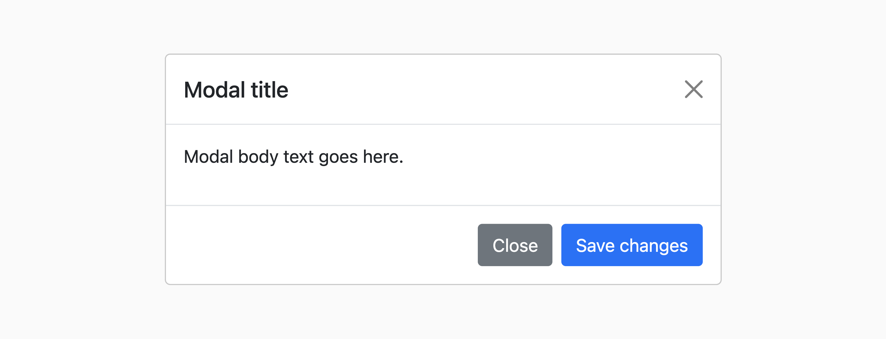
<div class="modal fade" tabindex="-1" id="exampleModal">
  <div class="modal-dialog">
    <div class="modal-content">
      <div class="modal-header">
        <h5 class="modal-title">Modal title</h5>
        <button type="button" class="btn-close" data-bs-dismiss="modal" aria-label="Close"></button>
      </div>
      <div class="modal-body">
        <p>Modal body text goes here.</p>
      </div>
      <div class="modal-footer">
        <button type="button" class="btn btn-secondary" data-bs-dismiss="modal">Close</button>
        <button type="button" class="btn btn-primary">Save changes</button>
      </div>
    </div>
  </div>
</div>
This creates a small, invisible user interface element that looks like the following:
in order to actually show the modal window, a few different options may be used:
- Add the data attributes:
data-bs-toggle="modal" data-bs-target="#exampleModal"to an HTML element. This will instruct bootstrap to show the modal with id "exampleModal" (using the default options) when the element is clicked - Using JavaScript, the following function can be used, ie:
let myModal = new bootstrap.Modal(document.getElementById('exampleModal'), {
  backdrop: 'static', // default true - "static" indicates that clicking on the backdrop will not close the modal window
  keyboard: false, // default true - false indicates that pressing on the "esc" key will not close the modal window
  focus: true, // default true - this instructs the browser to place the modal window in focus when initialized
});

myModal.show();
If we wish to hide the modal, myModal.hide() may be used.